Why Care Block:
Let’s be clear, I really like Stata graphics! There are people out there that complain about Stata graphics not looking flashy enough, but this is a really good thing – you have to know enough about the Stata graphics suite to make a graph look as bad as many new-excel-user graphs. “Let’s add drop shadow, 3D, hovering label boxes, gradients, and lots of pictures” is a good idea when you’re the van Gogh of graphics, but most of these graphs end up resembling more of a Picasso leaving the audience asking whether that’s a y-label, or a text box, or maybe even an eye…
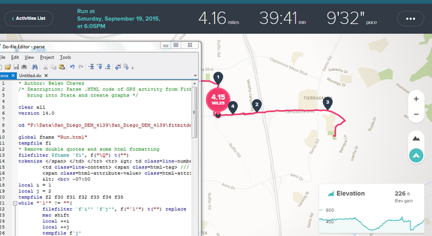
You may have noticed that there’s been a significant gap in these posts over the last few months and it’s been completely intentional. My talented friend, Belen, and I have been studying Stata graphics enough to be labeled as completely crazy, but at least it has resulted in a marvelous presentation for the Stata User Group meeting. This process involves a lot of JavaScript and Stata integration to produce Tableau-like interactive graphs using the same familiar syntax that all Stata users know and love. However, that’s not what we’re talking about in this post, no, get ready because today we are switching to graphic design with help from Adobe’s Creative Cloud! Look, all math and no art makes for some REALLY boring posts – and we strive to make sure no post is too boring. So we’ll spice things up by combining fitness, art, and math into one! Before we go any further, if you’d like to follow along you might need to get yourself a copy of Adobe Illustrator CC which comes with a free 30-day trial. Adobe Illustrator is a lot like the more commonly known Photoshop, but it specializes in making some really cool vector graphics. You know, logos, drafts, general art. Did you know that all Adobe products can be scripted using AppleScript, VBScript, and JavaScript? Today, we’ll take advantage of very simple JavaScript statements in order to beautify our data. Our example data for this post comes from the aforementioned Fitbit API. Belen and I both ran two half-marathons this year: the San Diego Half, the La Jolla Half, and the Rock ‘n’ Roll Half. Yes, there’s three halves here, that’s because we ran two separately and one together! While I’m very proud of our accomplishments, there’s a goldmine of data from our Fitbits just waiting to be visualized. Each Fitbit activity contains time, distance, location, heart-rate data and more. First things first, because the races started at different dates and different times, we should standardize our time variable (clock) to be time since the first gun start. gen time = clock - clock[_n-1] replace time = sum(time) duplicates drop time, force
We do this for both datasets, we’ll call them WM and BC. We’ll also preface all variables with the prefix WM or BC before we merge the data. This can easily be accomplished by the command:
ren * WM*
ren WMtime time
Now we can merge the WM set on the BC set and standardize.
collapse (max) WM* BC* time, by(Time) line WMelevation BCelevation Time 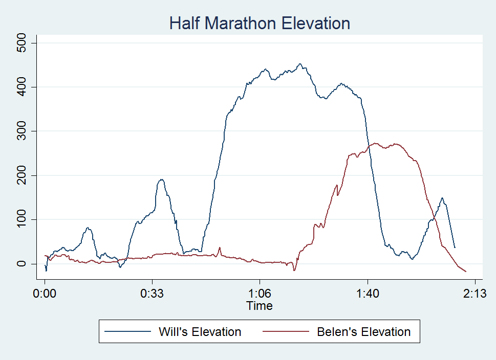
Look at that, a perfect 2D representation of our halves on the same axis. The x-axis measures distance and time to completion whereas the y-axis shows the elevation at that time. A steeper slope shows a very quick climb. This is my one issue with this type of graph, it doesn’t show just how grueling the La Jolla Half once you enter Torrey Pines National Park, but what doesn’t kill you makes you stronger.
Now, if you know about Adobe products but haven’t used any scripting yet, you’re in for a treat! With Adobe CC you can easily download the Adobe ExtendScript Toolkit IDE from the Creative Cloud, and this will allow us to do all of our scripting. Unfortunately, many of you might know of easier ways to do what we’re going to accomplish in the next step so I have to mention this is merely for informative purposes that serves to remove the roadblock of knowing how to integrate Stata with Adobe products. Back to the tutorial, let’s take this path for instance: 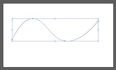
It has four anchor points at some set of coordinates in our drawing space. The coordinates usually take the form (x,y) so we can think of our path as an array of four coordinates. Let’s look how we might start creating this path in JavaScript:
var doc = app.activeDocument;
var stataPath = new Array(4);
Here, we set up our document as a variable as well as the path we’re going to create. Notice, the path is going to be an array with four elements. We start coding the elements as such (remember JavaScript lists initialize at 0): stataPath[0] = new Array(78 , 317); stataPath [1] = new Array(258 , 133); stataPath [2] = new Array(537, 330); stataPath [3] = new Array(828 , 154); Finally, we just have to add the following lines to have it actually draw our shape! app.defaultStroked = true; newPath = app.activeDocument.pathItems.add(); newPath.setEntirePath(stataPath); And that’s essentially it! I usually have Stata write the data I need to these arrays and enjoy how easy it is to create artful representations of our otherwise technical graphs. One quick note, you should probably transform your data so that it fits in the dimensions of your Illustrator file (or you can scale it later). Writing our script is extremely simple with the use of –filefilter – and loops.
tempfile f1
file open myfile using `f1', write replace
forvalues i = 1/`=_N' {
        file write myfile " stataPath [`=`i'-1'] = new Array( `=Time[`i']' , `=`init'[`i']');" _n
}
file close myfile
view `f1'
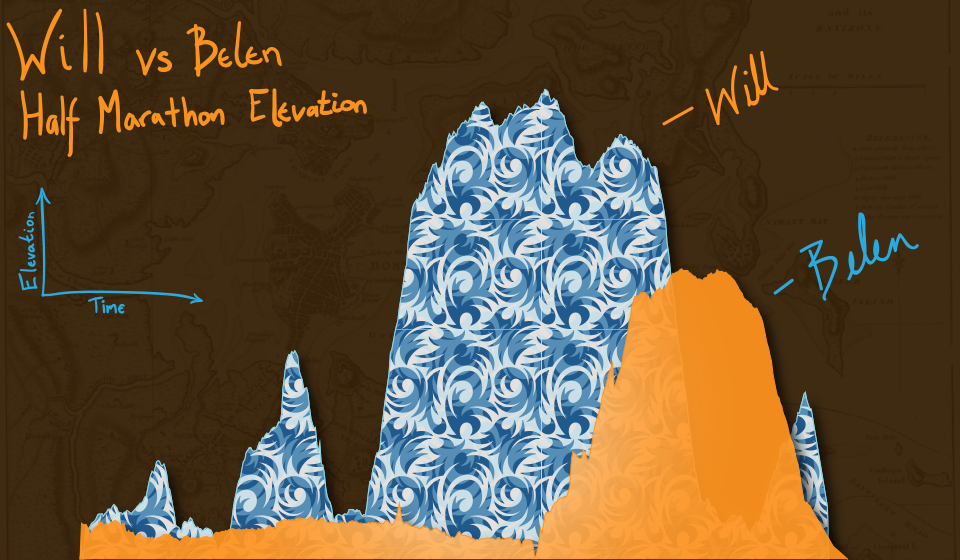
Once you run your script, the math stuff is over and it is time to make art! Happy drawing. In an unrelated note, the second reason for the lack of posts is because Belen has recently moved from San Diego and I wanted to take a moment to thank and acknowledge her for her contributions to wmatsuoka.com. She’s been my unofficial editor and a great soundboard for what ideas are too stupid to make the cut for the Stata blog. While it is always sad to see someone go, I wish her all the best in her new endeavors. Good luck, Belen! And here’s the final result of our blog: be forewarned that I am not claiming to be an artist.
5 Comments
You’re being tracked – in the world we live in today, almost everything you do has some sort of digital trace. I recently went to True North Tavern in North Park (San Diego) to mourn yet another 49er defeat – and to my surprise, they had a bouncer at the door checking IDs. I’ll admit, I am very lax in giving out my ID to anyone who asks for it, but on this occasion I did hesitate to provide identification a little as I saw a big black machine right by the door. Luckily, I made it through after a quick glance but as it turns out, a few friends were not so lucky. Besides visually checking ID’s the bouncers sometimes scan driver’s licenses into these black machines, which stores the patron’s driver’s license information including the photo! Today, we will explore why this is a very bad practice as we transition to talking about Exif data.
Exif, or exchangeable image file format, is a way to store information on your images or audio file. If you have an iPhone, you will probably notice that you can actually view your images on a map, and it shows you where and when you took the picture. This is really neat, especially if you’re a photo editor and need to match light or camera settings in Photoshop without having access to the physical camera. However, this is also incredibly dangerous. Here is a quick look at the properties of a photo I took with my iPhone 5. 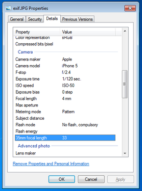
You can see everything, including the exact location of where I took the picture. Now, I’m sure this is not all that shocking, but it can be a little nerve wracking when you post pictures online knowing that someone can easily trace back where you were with a click of a button. Luckily, many social media websites such as Facebook and Twitter are aware of this and will strip your picture’s Exif data for you.
Exif data are stored in the header of your picture. What the heck does that mean? Every picture contains a header, and most new cameras and cell phones will actually write this data in the header. Your computer then reads this information and is able to tell your location, camera settings, and time stamps of the photo. One section actually contains all of the Exif tags – it’s really just a collection of information. In order to read this information, we have to read in the picture file which is a series of zeros and ones. Yup, we’re using Mata’s bufio() functions to read in all of this information. Bufio() allows us to write not only string characters, but also binary integers into files without using Stata’s file command. I will bore you with the details in a subsequent post, but for now, I’d like to introduce my program – exiflatlon – which strips JPG, TIF, and WAV file formats of latitude and longitude information. It can be used in two ways:
Let’s try out the directory specification.
exiflatlon, dir("C:\users\wmmatsuo\desktop")
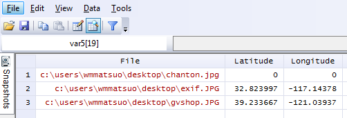
In the event there is no exif information, exiflaton will provide you with a warning and will replace those latitude values and longitude values with zeros in the resulting dataset. It only takes milliseconds to rip the locations off each photo – and this is valuable information, especially if you don’t want the wrong type of people (or really anyone) tracking you. While I only use Stata for good, there are likely people who use it for bad purposes. Only joking, Stata users are never malicious, but there are plenty of other programmers who are and who have more efficient tools at their disposal for such (and maybe creepier) purposes. In today’s age, we need to be careful about safeguarding our data because there are no moral boundaries when it comes to taking data. Companies love information, and will not hesitate to steal this information. After all, hiding the fact that “by entering this premise, you consent to us taking all your information from your ID” is in no way consent when it’s not clearly stated. I’m looking at you, True North Tavern...
Have you ever been burdened with making up data? Of course not, you say! How dare you charge me with such accusations! Well first, calm down. Sometimes it’s okay to “make up” data. For instance, for testing purposes: perhaps you have an idea of the approximate shape of the data you’ll be feeding into your program, but some lazy programmer isn’t providing you with the necessary steps to proceed. You could create a sinusoidal function to create an approximate representation, but who really has the time for that. The solution lies with a 3rd grader’s doodle.
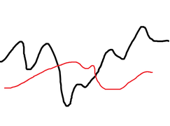
Balderdash! But really, it’s much easier to draw out the shape of your data that to input it cell by cell or create some function that’s going to be scrapped in the end anyway. Even better, perhaps someone put this graph in a presentation, but is refusing to share their base data. No problem for us. For this tutorial, we’re going to need to download GIMP, a free graphics editing software program that’s similar to Photoshop, but also drives me crazy because it has completely different hotkeys.
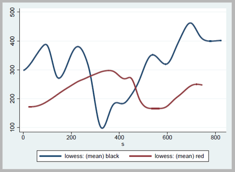
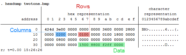
Take this image and open it in GIMP. Then make sure to save it as an HTML webpage. By selecting this option, GIMP converts every pixel to a cell in an HTML table, allowing for us to parse this information out ourselves. Remove HTML tags and only keep relevant information: each <td> tag should have a background color which is the hexadecimal RGB color of the cell. Recall that <td> tags indicate cell data whereas <tr> tags indicate a new row. Since each line contains a new bit of information, we don’t really care about the td tags. In fact, tag the <tr> tags (gen trtag = regexm(lower(v1), “<tr”), and take the running sum of that variable (replace trtag = sum(trtag)). This way, we have a corresponding row to each point of data. Create a running count variable by each row - this will give us column positions. Create a variable that’s equal to our column position gen black = run_count if y == "000000" gen red = run_count if y == "ed1c24"
Finally, collapse your black and red variables by your column variable: collapse black red, by(colpos) fast To make everything look nicer, I used the lowess command to smooth out my lines, but you don't have to if you're looking to get extremely accurate data. lowess black s, bwidth(.08) gen(bsmooth) lowess red s, bwidth(.08) gen(rsmooth)
* s represents our row count variable (trtag)
Finally resulting in: line *smooth s, lwidth(thick thick)
which gives us the following output in Stata:
PLEASE NOTE: Stealing graphs and making up data are bad practices. I wouldn't actually do this in the professional setting. This post merely serves to show how this process may be done.
This post is one of my white whales – the problem that has eluded me for far too long and drove me to the edge of insanity. I’m talking about writing binary. Now, let me be clear when I say that I am far from a computer scientist: I don’t think in base 16, I don’t dream in assembly code, I don’t limit my outcomes to zeros and ones. I do, however, digest material before writing about it, seek creative and efficient solutions to problems, and do my best to share this information with others (that’s where you come in).
First, let’s create a fake dataset with help from Nick Cox’s egenmore ssc command:
set obs 300
forvalues i = 1/200 {
        gen x`i' = round(runiform()*50*_n)
}

gen id = _n
reshape long x, i(id) j(vars)
egen count = xtile(x), nq(30)
keep id vars count
Today we will be making a bitmap of a map for Fitbit activities by writing bits of binned colors in a binary file. Alliteration aside, this post pulls from various sources and is intended to cover a great deal of topics that might be foreign to the average Stata user – in other words, hold on tight! It’s going to be a bumpy bitmap ride as we cover three major topics: (1) Color Theory, (2) Bitmap Structures, and (3) Writing Binary Files using Stata. Color Theory
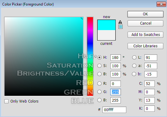
In creating gradients, it was recommended to me to use a Hue, Saturation, Value (HSV) linear interpolation rather than the Red, Green, Blue (RGB) interpolation because it looks more “natural.” I will not argue this point, as I know nothing about it. For me, I know that if I play with the sliders in Photoshop, it automatically changes the numbers and I never have to think about what it’s actually doing in the conversion. In order to convert from RGB to HSV and vice versa, I used the equations provided here – to learn about what’s going on, Wikipedia has a great article on the HSV cones!
|
|||||

HSV Gradient with a 5 px Gaussian Blur
|

RGB Gradient with a 5 px Gaussian Blur
|
| bitmap.do |
I’m personally extremely excited to reveal this next set of blog posts because it ties together so many different concepts. This means that it will be broken out into several different parts. However, the complexity also comes at a cost. I thought I would be done by now – the struggle is real!
While I continue to do my research, I’ve added a quick snippet of what’s to be expected:

So what’s the first step in creating this captivating art? Finding an easily parsable file format of course. The EPS (Encapsulated PostScript) format does just that – take a look for yourself:
EBEBEBEBEBEBEBEBEBEBEBEBEBEBEBEBEBEAEAEAEBEBEBEBEBEBEBEBEBEBEBEB EAEAEBEBEBEBEAEAEBEBEBEBEBEBEBEBEBEBEAEAEBEBEBEBEBEBEBEBEBEBEBEB EAE4E7E5E3DECFB292948D97A29D9F9D9FA9A6A49477726A5D4F484A4742484B 453B36302E2C302E2F3735332C2B32322C2D393C423E3738404950575E5F605B 545D655D5E5C5E6C6972767D888D9DA9B4B9BAC1B7ADA19995907A66646E6C7C 9099B7A99F9E9CADAB97838FB1CDE1E9ECEBEBEBEBEBEBEBEBEBEBEBEBEBEBEB EBEBEAEAEBEBEBEBEBEBEBEBEBEBEBEBEBEBEBEBEBEBEBEBEBEBEBEBEBEBEBEB EAEAEBEBEAEAEAEAEAEAEAEAEAEAEAEAEAEAEAEAEAEAEAEAEAEAEBEBEBEBEBEBThere’s no binary, just text. And while it may look like the transcript of a sugared-out toddler, it contains a lot of good color information. The first thing to know is that all colors we deal with are related to light. The three additive primary colors are red, green, and blue. If you ever looked closely at an old TV screen (like I did as a young’un), you’d see these three distinct colors. In this case, each color uses 8 bits: 2*2*2*2*2*2*2*2 = 256 possible combinations per color.
Each color then gets a number from 0-255. Zero means the color is off while 255 corresponds with a full-on color! So RED in RGB mode would look like this: “255 0 0”. Converting this number to base 16 yields “FF 00 00” or “FF0000” without spaces. Going backwards: “EAE4E7” is the same as “EA E4 E7” which converts to “234 228 231” in base 10. This is made easy with Mata’s frombase command.
After a few tricks - such as finding the right order of the data stored - we’re able to convert the previous gibberish to pixel information/excel cell information. This is where putexcel gets good. The matrix of color information is passed to a Stata dataset so that it utilizes the fpattern cell expression of putexcel. An example Stata variable would look like this:
V1
A1=fpattern(“solid”, “234 243 243”)
A2=fpattern(“solid”, “234 243 243”)
A3=fpattern(“solid”, “234 243 243”)
Because we have a column of strings we can use the levelsof command to create a list containing each of these expressions and write them directly using the putexcel command. Now we’re ready to shake shake shake out that final command:
foreach v of varlist * {
levelsof(`v'), local(`v') clean
local cellexp = "`v' `cellexp'"
}
local cellexp = subinstr("`cellexp'", " ", "' ", .)
local cellexp = subinstr("`cellexp'", "v", "`v", .)
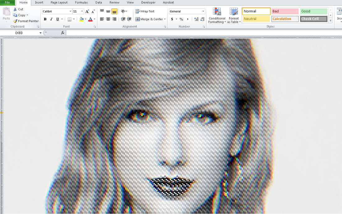
putexcel `cellexp' using "Art.xlsx", sheet("LoveStory") replace
The trick here is using the option "clean" in our levelsof command to strip all the double quotes so that we can use it directly in our putexcel statement. While we could have included the putexcel statement within the loop, the advantage here is that, because we’re only calling the command once, we don’t have to continually open and close the excel file for each putexcel statement - making it run in seconds. Now we’re ready to find our Starbucks lovers, get in fights at 2:30 am, and never ever get back together because we just saved ourselves so much time!
Can you spot all the Taylor Swift references? I count seven.
Author
Will Matsuoka is the creator of W=M/Stata - he likes creativity and simplicity, taking pictures of food, competition, and anything that can be analyzed.
For more information about this site, check out the teaser above!
Archives
July 2016
June 2016
March 2016
February 2016
January 2016
December 2015
November 2015
October 2015
September 2015
Categories
All
3ds Max
Adobe
API
Base16
Base2
Base64
Binary
Bitmap
Color
Crawldir
Email
Encryption
Excel
Exif
File
Fileread
Filewrite
Fitbit
Formulas
Gcmap
GIMP
GIS
Google
History
JavaScript
Location
Maps
Mata
Music
NFL
Numtobase26
Parsing
Pictures
Plugins
Privacy
Putexcel
Summary
Taylor Swift
Twitter
Vbscript
Work
Xlsx
XML
 RSS Feed